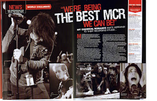
I really like the colours and fonts on this double page spread and I particularly like the positioning of the title on the double page spread. I like the way the images are layed out and was thinking of possitioning the images in a similar way myself before I saw this double page spread. I don't like the white banner down the side of the right hand page as it looks a little out of place, so I know not to do something similar on my double page spread.
I like the way the main bulk of the text is in paragraphs which slant to fit beside the band name, I think it looks really creative and eye catching. However there isn't actually much content on this double page spread and only one image, so I don't think I'll be using this style of layout, but I might use the slanted paragraph/band name idea.
I particularly like the way the images are displayed on this double page spread, its colourful, its eye catching and it just looks really good! I love the torn effect down the side of the white article section and I think it is something I will definitely attempt to recreate on my own double page spread!
My double page spread
I want my double page spread to include:
- One main large image which reflects what the article is about
- Smaller images arranged around the main image and on the bottom of the opposite page
- red/black/white colour scheme
- A back story to the band and then an interview with the band as my main text
- a fact file on one of the artists
- a small section on the bottom right hand page with gig dates on.


No comments:
Post a Comment