Tuesday, 29 November 2011
Research and Planning - Final Location
My final location for my rock magazine photoshoot is going to be St Mark's Parish Hall (Church) in Woodley, Manchester. As although the offer to use the Dominion Theatre foyer and stage in London is still open, it is unrealistic to think I am going to get amazing pictures from the location when I wont have my models with me and I'll only have 30 minutes to do the entire shoot. So I contacted the Parish Council at St Mark's Church to ask permission to use the grounds of the Church as my photoshoot location, as although I'm not religious, I thought it was only respectful to ask for permission before using the location - lukily the head of the Parish Council was happy to let us use the grounds for a few hours on Thursday, on the condition that we are respectful of the grounds and the dead. Plus, my band name is called Crypt, so a graveyard/Church is a perfect location for my magazine photos!!


Monday, 28 November 2011
Research and Planning - Plan For The Week
- Draft double page spread
- Draft Contents Page
- Take final photos for the magazine
- Start production of magazine on Photoshop
Friday, 25 November 2011
Research and Planning - Location Change
Although I may be able to use the Dominion Theatre foyer and stage for my location, I can't take my three models with me to London, which makes using the Dominion as my location a bit pointless! I have decided to use a church and graveyard as my locations as I am naming the rock band, which my models form, 'Crypt' which suits the Church/graveyard location and my models will be wearing red/white/black clothing to suit the rock style and the colour scheme of my magazine.
Thursday, 24 November 2011
Research and Planning - New Models
I originally wanted three female models for the cover of my rock magazine, however there are not three suitable female models available and so I am using one female and two males, which looks just as good - the ranges in height makes photo poses even easier to create too! Rather than drawing completely new drafts to show the change in the cover image, I went on http://www.weeworld.com/ and created little characters of my three models and dressed them as close to how I want them dressed for the photoshoot as I could. I then possitioned them in a pose which suits a rock band. I am keeping the same layout as my final draft, but using a different style cover image and different gendered models.


Models: left to right: Vikky (16), James (16), Danny (17)
In rock clothing:

In different rock clothing:

This rock band is going to be named either "Meltdown" or "Crypt" depending on which location the cover image is taken in. As if it is taken on a stage (one of my possible loaction options) they will be called "Meltdown" and if the photo is taken infront of a Church or in a grave yard they will be called "Crypt". I want everything to link together on my magazine. I want my models to wear the colours which are on the rock magazine and I want the photo location to match the band name, which will have to match the rock style and the over all look of the band. I want it to be as professional as possible!
Research and Planning - Pose/Model Test Shots
The pictures below are of my final models, in some test poses, in their own clothes, in preparation for the actual shoot for my rock magazine. Although I really wanted to use three female models on the front of my magazine, I can't find three which look appropriate enough and so I'm going to use one female and two males, which I hope will still make my magazine look awesome! I considered using myself as one of the models and setting the camera up on a tripod, however I feel it would just be easier and of a better quality for me to be the one taking the pictures and just use two male models and one female. The location is not my final photo shoot location, as we could not get there in the time frame we had, however I do like some of the test shot locations I have used and so I may take some real/final shots there too. The models are in their own clothing, which is why they don't particularly look like a matching rock band; when I take the final photos they will all be wearing black, red and white (which fits with the colour scheme of my music magazine) and will have their hair styled differently. They will also have props to work with when it comes to my final shots. These pictures were just to give my models and myself an idea of what was actually possible to do in preparation for the real shoot. Some of the photos turned out blurred and I'm not too sure why, as I spent an awful lot of time during the shoot ensuring that I focused the camera properly and held it as steady as possible, so I have only included the best shots from the session (I took over 40 pictures) however they are still very useful as preparation test shots.

I really like this shot, however I should have directed the models to look at the camera, as it would have looked better. Also, this image doesn't contain my third model (as he was running late). But I do really like this pose and I can easily recreate it in one of my final photo shoot locations and add my third model into the pose by sitting him in the space on the right hand side of the shot beside my female model. I really like the lighting completely whiteing out the entire top left corner, I think it is a really nice effect and I could easily put text over the top of it when creating the cover of my magazine, which is a bonus! The photo is clear and the lighting compliments the models nicely.

I completely love this 'power rock' pose as its eye catching and the stance, pose and intensity of the eyes makes it really powerful! the light coming through the window makes my models stand out more and makes the over all appearance more powerful. As the location is in college it is less than ideal, however the pose is one I can easily recreate in one of my final photo locations.

The tighter framing of this image, as apposed to the one above it, makes it look slightly better and more powerful, however I fear that if I was to use such a tight framed shot on my cover, I would have to put text over their faces. In all cover shots I need to leave plenty of the background location in the shot so that I have places to add the masthead and the text. However a tight framed shot like this would be perfect as the main image on my double page spread.

This picture is too dark, however I really like the pose and I think it would look great in a different, lighter, location.

As the light got brighter coming through the window the pictures I took got more and more blurred, so I turned on the flash (see pictures below) but then I had the problem of trying to avoid thick shadows forming on the picture.


I really like this pose, it looks similar to ones I've seen on proper rock magazines and it looks the most professional out of all the photos I took during the test shoot. I hope to recreate this when my models are in their costumes and in my proper location. The below pictures are just close/tighter shots of the above one.


Although the above picture couldnt be used as a cover image as its landscape, not portrait, it would still be a great picture to put on the contents page or double page spread.

I really like the picture above and below as it looks the most 'rock' out of all the pictures I took. I like the way the natural light illuminates my models' facial features as well as creating shadows around certain facial features, giving the images a distinctly rock style.


The above image is probably the least suitable for the cover of my magazine as any text I put on the cover would definitely obscure the faces of at least one of my models, which is not at all desirable! I like the pose, however I'm not sure it can be recreated in my final location, as it doesnt have the same stair structure.
Wednesday, 23 November 2011
Research and Planning - Photo Planning
Things I need to consider before taking my cover image:
- The lighting in the area
- The image should be bright enough to see the artists faces, but still dark around the edges to keep with the rock style which is dark and edgy
- The location its self
- Make sure no one else in the area ends up in my shots
- Make sure the location is completely appropriate and suitable and suits the rock genre
- Make sure it fits the colour scheme of red/black/white
- Magazine colour scheme (Red/Black/White)
- All images need to fit with both the style and colour scheme of my magazine
- Match the colours on the models clothing to the colours on my magazine cover
- Match the location colours to the colours on my magazine cover
- The Model & Pose
- Model HAS to have the 'rock look' about them before putting them in costume and restyling their hair, otherwise the images will not look convincing
- Model has to be someone co-operative who will do what is required
- Pose has to look suitable for the rock genre and has to look convincing
- The over all effect from the model and pose has to look realistic and believable that they ARE a real rock band.
- Consider all the above points for the cover image and apply them to the contents page image
- Make the images suitable for the contents page and what it contains
- Make the locations slightly different to the cover image
- Work out how many I will actually need and take more than needed in case some turn out undesirably
- All of the above points from both the cover and contents page images
- Make sure the photographs are suited to the title and over all style of the article and layout on the double page spread
- Make sure they are as good a quality as the cover image, as they will be the second largest images in the magazine I'm creating.
Research and Planning - Plan for the week
- Make double page spread drafts, one just a sketch/layout outline and one in full colour with an actual article/interview on it.
- Complete location recces/model consent forms/risk assessments
- Dress my models up and take test photos of them in the poses and locations I want in preparation for my real shoot.
- Get a definite yes/no answer off the Palace Theatre in Manchester & Dominion Theatre in London and a get pictures of my back-up location.
- Create a post on what I need to consider before taking the photographs for my magazine
Thursday, 17 November 2011
Research and Planning - Double Page Spread Inspirations
Below are some double page spreads from existing rock magazines which will help me to form my own double page spread for my rock magazine. I will look at the layout, images and language presented on the double page spreads to help me create my own.
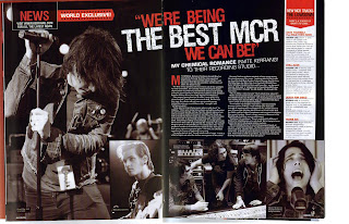
I really like the colours and fonts on this double page spread and I particularly like the positioning of the title on the double page spread. I like the way the images are layed out and was thinking of possitioning the images in a similar way myself before I saw this double page spread. I don't like the white banner down the side of the right hand page as it looks a little out of place, so I know not to do something similar on my double page spread.

I like the way the main bulk of the text is in paragraphs which slant to fit beside the band name, I think it looks really creative and eye catching. However there isn't actually much content on this double page spread and only one image, so I don't think I'll be using this style of layout, but I might use the slanted paragraph/band name idea.

I particularly like the way the images are displayed on this double page spread, its colourful, its eye catching and it just looks really good! I love the torn effect down the side of the white article section and I think it is something I will definitely attempt to recreate on my own double page spread!
My double page spread
I want my double page spread to include:

I really like the colours and fonts on this double page spread and I particularly like the positioning of the title on the double page spread. I like the way the images are layed out and was thinking of possitioning the images in a similar way myself before I saw this double page spread. I don't like the white banner down the side of the right hand page as it looks a little out of place, so I know not to do something similar on my double page spread.

I like the way the main bulk of the text is in paragraphs which slant to fit beside the band name, I think it looks really creative and eye catching. However there isn't actually much content on this double page spread and only one image, so I don't think I'll be using this style of layout, but I might use the slanted paragraph/band name idea.
I particularly like the way the images are displayed on this double page spread, its colourful, its eye catching and it just looks really good! I love the torn effect down the side of the white article section and I think it is something I will definitely attempt to recreate on my own double page spread!
My double page spread
I want my double page spread to include:
- One main large image which reflects what the article is about
- Smaller images arranged around the main image and on the bottom of the opposite page
- red/black/white colour scheme
- A back story to the band and then an interview with the band as my main text
- a fact file on one of the artists
- a small section on the bottom right hand page with gig dates on.
Research and Planning - Contents Page Inspirations
Below are some Contents pages from existing professional rock magazines which I have used as inspiration for planning and laying out the contents page for my own rock magazine:

I like the above contents page because I feel the layout of the images and text is really creative and just generally looks good. However, I think there is too much plain white space and using this style of contents page would not really match with the over all style of my cover and double page spread.

I completely love this contents page as it just screams ROCK as soon as you look at it from the layout, colour and over all style! I love the way the images are arranged on the right side of the page and I love how simplistic, but effective, the over all layout and style is. I like the way the contents page information is categorized and I particularly like the way the categories are broken up by different coloured banners to the rest of the text. To avoid having too much white space on my contents page I would probably invert the colours on the left hand side so that the background was black (not white) and the text was white (not black). I'd keep the category splitting banner red with either white or black text in. This is definitely the style and layout I want to try and re-create in my own rock magazine contents page!

Although this contents page looks very rock n roll, I personally feel its too busy and has too much imagery on it. It looks really good, but is hard to actually focus on and read. I definitely prefer the other two contents page layouts, colours, images and designs.
Research and Planning - Location (update)
After not being able to get hold of any management at the Palace Theatre in Manchester, I am resigning myself to the fact that I'm probably not going to be able to use is as my photoshoot location. There is a possibility of using the stage/backdrop at the Dominion Theatre in London (thanks to a good friend who is a cast member in the show on at the theatre and another friend who is Dept. Head of Stage there) However I only have one visit to the theatre before the final magazine deadline and so I really only have one chance of getting the shots I want. Plus, I can't take any college friend models with me, as they cant afford the train tickets! So I will have to use either myself, or some cast members in their rock costumes (from We Will Rock You the musical) as the models, which is not what my target audience wanted as they wanted models of a similar age to them (around 16) and the cast members aren't around that age (however they would look AWESOME!!). However, the Dominion theatre would be an amazing backdrop for my front cover.
Dominion Theatre:
Possible background 1:

Possible background 2:
 (minus the actors on the stage - would be amazing to get my model in a rock pose on the platform on the stage in front of that background)
Possible background 3:

Aside from the Dominion Theatre, a perfect location would be somewhere with lots of red, black and white around it... like white steps with red railings, or a red brick wall, as it will match my colour scheme. I have yet to find an exact location which I wish to use, but I am still looking and am hopeful for one of the two theatres to allow me to use their stage and backdrops.
Dominion Theatre:
Possible background 1:

Possible background 2:

Possible background 3:

Aside from the Dominion Theatre, a perfect location would be somewhere with lots of red, black and white around it... like white steps with red railings, or a red brick wall, as it will match my colour scheme. I have yet to find an exact location which I wish to use, but I am still looking and am hopeful for one of the two theatres to allow me to use their stage and backdrops.
Wednesday, 16 November 2011
Research and Planning - Headshots


This model looks too timid and soft for the rock style genre. She seems to be more suited to the pop/indie genre as she is very pretty and has soft tones to her face rather than the harsh edgy ones which are typically associated with rock models and the rock genre as a whole. I'm sure with a bit of styling this model would be great, however I'm not sure she would be comfortable dressing and being styled in the way that I desire and if she doesn't feel comfortable the photographs of her in poses will not be particularly convincing.


This model is clearly suited to the rock genre as he is wearing a rock band t-shirt and has a rock hairstyle! He is very suitable for my rock magazine as he is and so would look perfect once styled in the way I desire. However, he is male and my target audience feedback tells me they want a female on the cover of my magazine. However, I could still use him in another part of my magazine.
Research and Planning - SLR Practice (2)
After some of my photos were less than a desirable quality in my first SLR photo session I decided to have another practice to try and get better with the camera before taking my music magazine photo shoot shots.
Practice Shots:


I feel my photo taking skills are improving now that I'm getting more familiar with the SLR cameras.
Practice Shots:


I feel my photo taking skills are improving now that I'm getting more familiar with the SLR cameras.
Research and Planning - Plan for the week
Plan for this week:
- Take pictures/videos of photo shoot locations
- Get headshots of possible models and evaluate their suitability
- Print location recce sheets, model consent forms and risk assessments
- Practice putting models in poses and taking photos of them with the SLR cameras
- Contact Palace Theatre management - phoned Box Office and got told to ring again when the theatre its self is open and speak to a member of the theatre/stage management team about using the place as my photo shoot location
- Prepare ideas for the double page spread in preparation for next lesson
Monday, 14 November 2011
Research and Planning - Costume and Props pictures
After making my costume and props list I got together some of the costume items and props I already had at home and took pictures of them:


Accoustic Guitar
Black accoustic guitar - perfect prop for my model to really look like a rock star. I will teach my model to play a few simple chords and take pictures of them whilst they are playing to put on the double page spread of my magazine to make it look like the pictures were taken from a rock artists gig.

Sunglasses
Reflective silver lense, silver frame, rock style sunglasses - perfect for to achieve a really believable rock style look. Suitable for both a male or female model. Covering the eyes of the model gives them a mysterious rock look which looks attractive on the cover of a magazine.

Wrist Accessories
Rock stars typically wear loads of accessories on their wrists to complete their rock style look. Most rock wrist accessories are leather with silver, black or coloured square studs on (like the accessories pictured below). Most rock finger accessories are metal black or silver rings, usually worn on the thumb.

Trouser Accessories
White belt with black square studs on, with a metal rock style double guitar shiny belt buckle which will really make my model have the rock edge and style. Silver chain which will add to the over all rock look of my model.

T-Shirts
Freddie Mercury T-Shirt - wearing an iconic rock star on a t-shirt would make the model look like a rock star too.

Green Day T-Shirt - modern rock band t-shirt, perfect for a fan or fellow rock star to wear.

Queen T-Shirt - classic rock band t-shirt , perfect for a fan or fellow rock star to wear. Both the Green Day t-shirt above and the Queen one below are suitable for my model because my rock music magazine contains a mixture of classic and modern rock: Queen is classic, Green Day is modern.

Black T-Shirt with colourful print - this style t-shirt seems to be the latest trend amongst rock fans and artists alike. This is the style of t-shirt which I originally said I would get my model to wear, however any of the above styles are also suitable.

Shoes
The style of shoe below (Converse/Vans) is the usual style of shoe/trainer worn by rock artists and so I feel they are suitable for my model to wear. I dont know which colour will suit the over all style of my rock model, so I have a few for them to choose from!
Leather Jacket
Leather jackets are something ALL rock artists seem to have and so I want my rock model to have one too! They just seem to enhanse the over all look of the rock artist; like a final touch.

Subscribe to:
Comments (Atom)